Showing posts with label weekly textile construction. Show all posts

Thursday, February 24, 2011

Bet You Can't Print Just One


Monoprint on canvas and muslin using textile paint
approximately 11 x 13 inches

In my recent profile of artists Jette Clover she shared with us that she does a daily practice by making a small collage each morning. I like the idea of that but I have at this time not made that commitment. I have however found a way to "practice" and explore that I want to pursue and that is through making small monoprints. My intention is not to do them daily but I have discovered that when I work at this scale with this technique that making "just one" is not possible. It is sort of like eating only one of those famous potato chips.

What you are seeing in the first image is actually two pieces of fabric, one canvas and one muslin that have been laid side by side, photographed and photoshoped quickly to appear to be one composition. The idea is that these are primarily studies which could be taken forward into small finished works or kept as they are and studied for inspiration.

In this first piece the textile paint was smeared onto an acrylic plate and pressed onto the canvas. There was still paint on the plate so I made a print onto muslin. I love the ghostly appearance of each side and actually printers call these second prints from a single plate - "ghost prints". It is easy to see that they are similiar but there are wonderful gradations in each that are different enough to keep things interesting.

I plan to try this again so here are the things I will immediately be thinking about.
  • Begin with using only Black then introduce other values or other colors
  • Make many prints and ghost prints on same type of substrate
  • Try a variety of substrates including paper
  • Print one image directly on top of first print but perhaps turned 90 degrees or upside down
  • Print many images on larger pieces of fabric
  • Print two different prints on the same substrate
  • Experiment with different brands of textile paints and acrylic paint or thickened dye
This list gives you the idea.


Monoprint on Canvas - Two French Curves
approximately 8 x 8 inches


Monoprint on Canvas - Two French Curves detail

In this print you can see that indeed I did do some of the procedures I listed. I printed the initial surface with red textile paint twice. I then used an acrylic french curve painted with textile paint and printed it onto the canvas. Finally I "framed" it with small black lines printed from the edge of my acrylic plate.


Monoprint on canvas using textile paint
approximately 8 x 4 inches


This small print is also made using canvas and textile paint. The paint dries quickly so that you can add additional layers in one session. Here the black and orange appears to be a landscape
and the white layer gives depth and movement to the composition. I still have not decided how much "hand" is too much hand for my tastes. It is very different from dye for sure.

One of the things I really like about these small pieces on the computer is that you can "see" them at any size you imagine. To me the first piece can be seen as 18 x 24 or larger etc.

When you prepare to work with this process I suggest you cut many pieces of the materials you want to print on and have them ready to go. Lay out one color or a few colors and begin. You might find yourself with a nice stack of prints at the end of your exploration and ideas for a larger work or ideas for another session of small prints or both.

Thank you for spending time at Studio 24-7. I love hearing from you and remember:

Commenting is FREE!!


Wednesday, June 9, 2010

INSPIRATION: GERHARD RICHTER


First Section - Terry Jarrard-Dimond - unfinished


Internationally know painter Gerhard Richter is a German born artist who lives and works in Cologne, Germany. I have been aware of his work for some time and while looking through the March 2010 Art in America saw an ad for the Edward Tyler Nahem gallery who represented Richter's work at The Armory Show - Modern this year.

The advertisement featured a detail of a work entitled Abstraktes Bild. The richness of color, texture and layering is a visual feast. I am not showing that work as I do not have permission to do so AND I want to encourage you to visit his website: http://www.gerhard-richter.com/

Here you will find extensive information on this visionary and enormously productive artist along with wonderful videos of some exhibitions. Look at the range of sizes of the work from massive to very small. Enjoy the galleries as they are huge. It's fun because you can hear what it sounds like to be in the spaces and the commentator is very good.

After several days of studying the image in the magazine I decided to monoprint a piece of fabric and use the colors and general layout of the work. Of course there is the issue of opacity which dye does not have but serves painters very nicely. I have seen flickers of the illusion of opacity with dye on fabric but certainly can not intentionally reproduce that lush surface at will.


Layer One - It appears green but it is an intense yellow.


Layer Two - Fuschia


Layer Two - Detail


Layer Three - Intense Blue


Layer Three - Detail


Full View of Fabric


The color of photograph is not just right but you can see the general idea. Rather than do anything with the piece as a whole, I decided to cut the piece up and try to do something a little different with each piece. One of the things I found of interest when I looked at the Richter videos was a small series of painting on glass where he presented each work in relation to a second slightly different work. I often work in a diptych format so I may try to find or create a companion for each section that I have cut.


Another example of a section.


In the coming weeks I will share the results of this process here at Studio 24-7.

Thank you for dropping by and please feel free to comment. I love hearing from you.


Wednesday, March 24, 2010

Loving Instant Potatoes


Finished Fabric

My last post featured the beginning process of using Instant Potato Flakes as a resist. It was messy but the results are beautiful!


Dried Potato Resist

Here you can see how the paste has dried. It took 3 days including putting outdoors in the sun on the last day. Notice now the fabric has curled. I had it pinned down but the tension from the drying pulled the pins out.


Notice how irregular the marks have become. As the paste dries it pulls away from the fabric around the edges and makes beautiful markings.


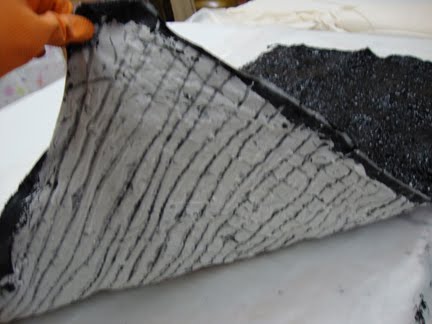
Once the potato paste was dry I applied the thickened dye. I used a Pro Chem Black 609 and a very thick print paste. Due to the extreme texture of the surface, I had to use a short bristle brush and dab the dye paste on.


You can see how the dye is seeping through the marks made when the paste was dry.


This picture is still the back of the unprocessed fabric but it looks the way I thought the piece would look when finished.....not so.

After 48 hours I folded the fabric up and baked in the oven set at 200 degrees for about 20 minutes. The entire house smelled like mashed potatoes.


Finally I just could not wait any longer and decided to wash things out. It was cold and windy outside but that's where I had to go for this job. I laid the fabric on the grass and soaked it good with running water. I used a plastic spatular to scrap off the paste and finally resorted to the bondo scraper as this paste really clings.


We have had very chilly weather and I don't think I had kept the fabric warm enough as there was lots of dye run off and it back dyed the fabric but the color is beautiful. Look at the exotic marks. I see all sorts of little people, animals, plants etc.


There are lovely violet markings as well. I have been working in such a loose way that I never know if I can repeat something but I'm planning to work with this more and see what happens.


So here we are back with the finished fabric. I'm not sure what is next but I do plan to make this into a finished piece. I'm thinking it needs friends.


Thank you for visiting and your comments are very welcome!

Thursday, January 28, 2010

Going Dottie


Remain calm and don't adjust your sets. This is the picture you are receiving or something like it.

I have had an interest in dots, spots, blobs etc. for about a year. I painted dots on a collection of previously dyed fabrics last year and actually made one large piece with the fabric but haven't been able to follow it up as I've been working on other things.

Last week's textile exploration received a good amount of interest and so I wanted to continue with another study in line with TC #1. The yellow fabric with the black dots was laying around my studio as I had used some in a new large work and I love the fabric. I started by applying dots of soy wax, overpainting in yellow and then applying the black dots with activated dye. The areas that were protected by the wax are a kind of glowing gray/white and some areas of the yellow are more intense than others......So.......

I cut a rectangle of the fabric that has more of the electric yellow and started exploring what would happen if I put small patches of other fabrics on top in reference to TC #1. I tried several things and here is what I have come up with.


I took into consideration the suggestions of Kathy and Judy. Kathy suggested I do handwork on the piece and Judy suggested I include some really large pieces. I am following both of those suggestions in a modified way. As you can see, there are pins all over the piece. Everywhere there is a pin there is a small piece of fabric laying on the surface. I am stitching each of those pieces in embroidery thread to the background and I have included a few larger elements and allowed some elements to begin to 'merge' to create larger elements. I choose not to include a really large element as I did not want to overpower the dots. I will be working on the piece and will post the finished work at the end of next week.


This may be somewhat strange to some people but I certainly didn't invent dots. Two of my first thoughts about dotsweree: aboriginal art and Larry Poons.

Aboriginal artists often use dots painted across the entire surface of a painting. Sometimes in one color and sometimes in a variety of color. These painting often refer to very specific locations or stories that are part of their cultural heritage. You can read about Aboriginal "Dot Paintings" here.

Larry Poons is a well know contemporary painter who gained the attention of the art world with "his paintings of circles and ovals in brilliantly colored backgrounds."* Click here to read an interesting interview with Poons.


Untitled Painting by Larry Poons, 1964


This work was considered Op Art and it celebrated illusion and color and it shares some visual commonality with the so-called primitive work of Aboriginal painters.

I believe my interest in dots put me in some interesting company.

Love to hear from you and check back in on Monday as I have a new Artist Profile on Phil Garrett, painter and printmaker.

Saturday, January 23, 2010

First Study of 2010


Completed Textile Construction #1 2010


If your weather has been like ours here in SC, it has been a colder, damper winter than usual. This has really made it difficult to get into my wet studio and so it inspired me to work on some ideas for studies that don't require that studio.

I have been thinking for some time about exercises to help people break through creative barriers and generate new ideas. I think that sometimes the very process that we use for 'finished' work acts as a barrier to exploration so I decided to try some ways of working that allow you to start immediately and freely. I have also been thinking a lot about obsession and how some artists are able to use their ability to stay with an idea to create amazing and wonderful work. The following exercise is a result of these thoughts.

I started by creating a procedure that I would follow. I've talked about this before.

Procedure

  • Select a piece of fabric that will be the substrate on which I will sew (12" x 12")
  • Select several fabrics in colors that I know will be interesting together
  • Cut the selected fabrics into small pieces in a free manner
  • Place all cut fabric in a container and mix


Cut bits of fabric


I prepared a batt of the substrate fabric, cotton fabric and backing fabric. I determined that I would sew the cut fabric to the substrate in the following manner:


Quilt sandwich
  • Working directly on the fabric sandwich, blindly take a small 'stack' of the cut bits and sew to substrate. I call this Organized Random. It is organized because I preselect the colors and it is random because I use them as they come out of the container.
  • Start by sewing one row in the center and work out to each side
  • Turn and sew crosswise rows until the bits are all used


First row of bits.


Second row of bits being sewed to substrate.


Here you can see that I have used all the bits I had cut and I was only about half way throught the second set of rows.

After looking at the piece at this stage I decided to cut some bits from pieces of the substrate green fabric and finish the vertical rows. The idea being that it would bring the green back to the surface.


Here I have completed the second set of vertical rows with green.


The piece was then squared up and I added a binding which is turned to the back. I like the effect and I plan to do more. I promise, next time I will use something other than green and red;)

What do you think about this way of constructing a piece?


Friday, January 1, 2010

RING IN THE NEW


RED WHALES IN A GREEN SEA


2010 is here and my wish for myself and all of you is that we have a more peaceful and prosperous year than 2009.

I began my blog in April of 2009 without a real clue as to what I would do but amazingly it took off and I was able to learn on 'the fly'. Today I am attempting my first blog post via my MacBook which is replacing my aging but always reliable Dell. Wish me luck.

Studio24-7 has had three main types of posting: Weekly Textile Constructions, Artists Profiles and an online project ' Compositional Conversation'. CC was finalized and there is a separate site where you can more easily read all the articles and I may add additional information from time to time. I will continue to present artists interviews and I will be sharing my small explorations but I am shifting from weekly to monthly.

If you are familiar with my main body of work you know that while I use hand dyed fabric, the focus has been on large spare shapes and figure/ground compositions. That is what I thought I would explore in my weekly studies but very quickly the focus shifted to surface design. I have loved this exploration but found that the time required to process these works each week was much greater than working with my usual hand dyes and it has been hard to keep up so.....I will commit to one new small study per month which will allow more time for my larger pieces but I know I will do more and I'll share those as they develop.

So with this new concept I am presenting the last Weekly Textile Construction from 2009.


A few weeks ago I presented a piece made from fabric I had dyed using a flour paste resist. I love the interaction of this paste with the dye. I admit that working with the paste itself is not a joyful experience but the results are beautiful. I decided to try it again and see if the results were similar to my first attempt so I pinned 2 - 18" x 18" squares of muslin to design boards, applied the flour paste and drew with the end of a plastic fork (one after the other), allowed to dry, and then painted over the entire surface with activated thickened black dye. Here is the results.


Muslin which has been painted with black dye over a flour paste resist.


Detail of the beautiful surface.


You can see that I drew the same pattern on both of these that I used on the first study. I played with them a bit to see what I could do with them and then decided to add some color. I did this by soda soaking then scrunching each piece into plastic shoe box containers and pouring small amounts of dye over the fabric. I used a green (don't remember which) and a pineapple color. Here they are.


Piece A


Piece B


I liked the color but still I didn't feel excited. Then I decided that since they were so similar that I wanted to combine them. I started by cutting a few strips off one of Piece A, cutting it into freehand squares and sewing them onto Piece B. I had already added a batt and a backing to the Piece B and made a sandwich so I was sewing directly to what would be the finished piece. I applied two vertical rows and two horizontal rows. This was creating a nice texture but because they were almost identical, texture was all they added. Then I decided to cut a square of fabric out of the center of Piece A, cut it into small squares and add to the center of the 'sandwich' composition. I used red thread to sew. This created a small area of interest in the center but still it was not strong. As I observed the piece I saw that the shapes of the original drawing were still there but needed to be exposed and that is when I added the strong red strips of fabric. I used a bright red on the left and right and a deep brownish red in the center which emphasized the illusion of the center red element being behind the tilted square. I tried turning the piece in all 4 directions to find the right view.


I have a small demo piece Kathy Loomis made for me some years ago which demonstrated the technique of creating shapes from strips of fabric. This demo piece is framed and hanging in my studio and I acknowledge the influence.


I now call WTC #32 , Red Whales in A Green Sea. I squared it up and finished it immediately.


All of this texture and complexity of surface is very exciting and I do intend to carry it into some larger works.


Thank you for visiting my blog and hope you will return. Comments are always welcome.


Saturday, December 5, 2009

Weekly Textile Construction #31


This week has been a struggle with computer problems which still persist. If you have written and I have not responded , that is the reason.

My WTC is a nice surprise....for me. As often happens, I had another idea in mind but it didn't get completed so I found this nice piece of monoprinted fabric and decided to work with it to see if I could add some color through stitching and it has resulted in a nice little piece.

OK, monoprinted fabric cut and pieced and stitched to a piece of medium weight cotton duck. I have been exploring stitching a few pieces directly to canvas or cotton duck and skipping the batting. The jury is still out on that but in this case it worked nicely. Easy to stitch and it has a nice hand. I haven't totally decided how I am going to finish the edges as yet.

I used yellow, orange, orange/red, bright blue and purple DMC embroidery thread and did a sort of Kantha stitch in the areas I liked. The stitching lines follow the brush strokes. If you see color other than black/blue or gray, it is from the thread. Simple and effective.

Monday I have an excellent Artist Profile on Arturo Alonzo Sandoval so hope you will drop by. I have not as yet received the Compositional Conversation piece back here in SC but will report on that as soon as I have something to show you.

Have a great weekend. Terry

Monday, November 30, 2009

WEEKLY TEXTILE CONSTRUCTION #30

Weekly Textile Construction #30

Hope all of you had a wonderful Thanksgiving including family, friends and good food. Holidays are an opportunity to take a little break from our routines but after a couple of days I am always ready to get back to my studio and get to work.

This week I'm sharing a small piece made from fabric I monoprinted several weeks ago. I have gotten interested in 'black and white', painting, monoprinting and texture...lots of texture.


Using my fabric of choice, Kaufman Prima, I monoprinted an 18" x 18" inch square with activated silk black dye from Pro Chem. I painted the thicken dye on a sheet of acrylic and laid it face down on the fabric to make the print. Kaufman no longer manufactures Prima which is a lovely muslin with a silky hand...too bad. I have a small supply and dread the day it runs out.


After processing the fabric I cut it in half, flipped one half over and sewed the two pieces together so that one half is right side out and the other side shows the back of the fabric. The lighter side is the fabric back.


Using a very soft polyester thread called Invisifil, I quilted the piece using a zigzag stitch and inserted pieces of yarn as I went along. This added additional texture both visually and physically.


Detail TC #30

I like the richness of the surface made by the paintbrush when I prepared the monoprint plate. There are lots of shades of 'black'. Actually, this dye has lots of blue in the mix and there is a nice blue cast to the markings. I mix a very concentrated mix of dye and often in the wash out process the white of the fabric will take on a gray tone. In this piece the white areas have an almost beige tone. I have no explanation for this....it's chemistry and I bow to the laws of that science.

I'm still planning to publish the next stage of Compositional Conversation this week. Hang with us just a bit longer. Thank you for dropping by and I would love to hear from you!

Thursday, November 19, 2009

Weekly Textile Construction #29


During the past 9 months I have met a number of wonderful artists via this blog, facebook and twitter. One of those artists is Rebecca Howdeshell who I think I met first via twitter. Rebecca's work is elegant and rich and complex and spare all at the same time. One of the materials she utilizes is industrial felt which I had heard of but wasn't sure exactly how that might be different from 'regular' felt. I ask Rebecca if she would send me a little piece thinking she would send some little scrap but instead she sent me a nice piece that is roughly 8" square. Thank you Rebecca.

When I saw what she had sent, I pinned it up in my studio for a few weeks just to enjoy. The felt is a beautiful off white (more white than some of my pictures) and about 1/4" think. I knew immediately I might have a hard time experimenting with it as I would want "to make something" so I just let it hang on the wall.

This week I deteremined to take it down and see what I could do with as a material.

My first thought was to sew on it as I know Rebecca does. Despite the thickness of the material sewing on it is like sewing on butter. I used a very thin/strong off white polyester top thread and an off white Soft Touch in the bobbin. Using a couching foot, I inserted bits of black perle cotton to make a broken line drawing.


Couched Lines


Detail of couched lines which were zig zagged.

Back side of stitched felt.


Very pretty effect. The back was as nice as the front. The stitching lines sink in and create a beautiful texture. You can see on the back that I added an outline of stitches without inserting any of the back yarn. I did this to just emphasize the shape.

I was tempted to just keep drawing with the thread but I reminded myself that this was an experiment so using the same thread I changed the machine foot and did two rows of some sort of honeycomb stitch...don't know what it is intended for.

Honeycomb stitch upper right corner.

You can just make out the stitching so I thought I would apply some color using oil paint sticks.

Stitching is now on the right and the oil paint stick makes it show as dots.

The paint sticks attached itself to the wool easily but it just looks dirty. Later I ironed is with parchment paper so as not to get it on my iron. Heating the oil stick makes it permanent.

The pink is watercolor crayons which have been painted with water.

I knew I could dye this material but I did not have the correct type of dye so I decided to apply more color using watercolor crayons and then painting over this with water.

Other materials I tried were: black acrylic Ink....leaf shapes on left , clear school glue as a resist...can't see any effect, and Jacquard Dynaflo paints...the acid green. All of these materials adhered to the felt nicely but not deeply. The are all very much on the surface.

I am going to investigate what type of dye to use and I'm going to dye it and see what happens. I'm not finished with this little experiment as yet!


Thursday, November 12, 2009

Weekly Textile Construction #28


Last week I tried my hand with a flour paste resist and had excellent results so I thought I'd try it again. I laid out two pieces of fabric and applied the paste but I did not take into account that we were having very different weather. Last week it was warm and sunny while this week it has been cool and rainy. The result of that weather change was that I saw very quickly that the paste would not dry in time for me to apply the dye and complete a piece.

So what to do.....I spied a piece of fabric I showed you a couple of weeks ago. It was the black dye painted piece I used to illustrate my 'undocumented' work for the Black and White Show at Quilt Visions. It had some nice areas but would never do as a work unto itself so I decided to cut into it. My idea was to remove some areas and put another fabric under it and see what happened. That is exactly what I did and it only took a few fabric auditions to decide on the fabrics you see in the picture....the yellow/green patterned fabric.


This is the entire piece of fabric I put together. The version at the top is how I will crop it when I am ready to finish the edges.

I cut the the shapes I wanted and applied them to the fabric underneath by sewing them together. I suppose this is called raw edge applique. Then I did some intense quilting with three different threads.

I really like the look of this piece. It's kind of cartoony (is that a word?). The shapes are not very pleasing but that could be worked with were I to take it to another piece. The color combo of black, white, yellow and yellow green really pops and has a strong voice.

The two patterned pieces are from my Peas and Carrots series which is a never ending series composed of small bits of fabric I dye when I have just a dab of some dye concoction left after doing a larger project. I can't stand to wash it down the drain so I use it on these tid-bits. The Peas and Carrots reference relates to kids (or adults) who when eating, try to make all their foods last evenly through the meal.

On another topic: I have a show of 10 of my small pieces on exhibit at the Fran Hanson Gallery in the South Carolina Botanical Garden in Clemson, SC. Here are a few shots from that show.


For those of you who have been following the Compositional Conversation, I will be publishing the next version on Monday by Leslie Riley. Folks, it is amazing so hope to see you then.