Showing posts with label educate yourself. Show all posts

Thursday, September 9, 2010

A Revolutionary System


Index Cards, File Dividers and a Plastic Box


Recently I wrote about issues relating to the complexity of preparing show entries and found that many of you share my feelings about the process. One of the issues I did not touch on is how I plan my entries so I thought I would share just a bit about that.

The first year (about 4 years ago) that I decided to enter multiple shows, the scene in my studio was total confusion as I prepared by entries. I had not been keeping an inventory so I did not have a listing of when I made a specific work, it's title, it's size, a price list or anything else. I simply had work. No images either.

I began to review the information for each of the shows I planned to enter and was immediately confronted with conflicting dates, overlapping dates and all the issues about formating images etc. Fortunately my photographer is also my husband, Tom, and he kindly stepped in and we got the work photographed, CD's made and shipped and I only messed-up one entry (that I know of) and that venue allowed me to just re-submit.....if they are reading this, Thank You! (I had listed one work and sent an image of a different work.)

From that point I realized that I needed an inventory, ongoing photography and some way to track where the work was entered, if it was accepted, and when it needed to be shipped and returned. I looked a many software programs to see if any would satisfy my needs and while many had very good features I ultimately came up with a "Mixed" system designed by Terry.


So here's what I do.

  • I have a folder marked: Prospectus. I download and print information and forms for any show I think I might like to enter. The hard copy goes in the folder and I save a digital copy in a digital Prospectus folder.

  • I have an index card for each piece On this card I note the title, date of completion, size, processes and materials used and price. I list any show in which the piece is entered, acceptance or rejection, date work is to be shipped and returned...I love being able to look through my box and find that information.

  • I make a card for each show I enter and list the entries on that card and what is accepted or rejected. This is very helpful in succeeding years to see what was entered. I also note if the work sells. This is also posted on my Digital Inventory.

  • I keep and dated Digital Inventory with title, date, size and price. I try to keep this up to date and delete old inventories as I make changes.

  • In my personal datebook I note when work needs to be shippped and dates for openings.

  • I keep a large notebook which contains cover sheets for each individual show. As I enter shows, I store the printed prospectus and a copy of the entry form along with shipping forms etc. in that sleeve. At the end of the year I can clearly see what I have done and have everything for each show in one place.


Now when I plan my entries, I first read the material and think about what I have that will be approporiate for a specific show. I begin by viewing my digital images. I then pull the card for each work that I choose and move on from there. If I need to cross-reference dates I pull the prospectus. It seems to be working.

I am not a Luddite. I love my Mac and all the things I can do with it, but I like the physical world of an index card, a notebook, and a folder. For now it seems to be working.

Thank you for spending time at Studio 24-7. Commenting is FREE and I love hearing from you!

Friday, June 25, 2010

What's It All About?


Confronting the Moon
Hand Dyed Fabric, Machine Pieced and Machine Quilted
Terry Jarrard-Dimond


This fall I will have the pleasure of teaching at Quilting by the Lake 2 at the Schweinfurth Memorial Art Center in Auburn, New York. As part of that event I was invited to send a quilt for the show which will be held this summer during Quilting by the Lake. I selected Confronting the Moon because it is one of my favorites and hasn't been shown that much.

The folks at Schweinfurth requested we write a statement to be included with the work as an additional educational component of the show. This is what I wrote about this piece:

Shape and the relationships between shapes has played a large role in my work for several years. Confronting the Moon is a simple "story" about confrontation and how the perception of size and power can be altered by posturing and intimidation.

Wow! So that's what I was thinking! Well, no it wasn't exactly what I was thinking when I began the piece but that is what the piece says to me today. This little experience of writing that statement has made me realize that I need to do that EVERY TIME I COMPLETE A PIECE and then again in a month or a year or some passage of time. I had to do this in graduate school but I have not been doing this recently and I believe I have been missing out on some important information and insight. While some artists may begin every work with a specific goal or intention or idea, that is not true for me. My work can start from may different point and the "meaning" surfaces as the work is created. I think that makes it even more important that I pay more attention to my thoughts when a piece is complete.

Some months ago I did an Artist Profile on Arturo Sandoval. I don't ask for a huge amount of information from my artists but Arturo sent me a wonderful packet of statements that he has written over many years. I sat down and read them all and it was a great read. It gave me some excellent insights to his thinking and this type of information is historically significant both for his specific work and for what artists are and were thinking at a given time.

So, my intention is to write some type of statement about each new work and then revisit that statement in the future. I encourage you to do something along these lines. I know you will be surprised at what surfaces and what you learn about yourself and your work.

Thank you for spending time at Studio 24-7 and I always love to hear from you.


Tuesday, April 6, 2010

New Flour Paste Formula


Some time ago I did a couple of pieces using Flour Paste as a resist. I loved the results but the paste itself was difficult to apply and the window for application was very short. You can see those results Here. Next I tried a Potato Resist which also gave good results but I found it just seemed unnecessarily messy to apply, especially if you wanted to spread it to a large area.


Both of these resists give interesting results so I was interested when I read an article on my friend Judi Hurwitt's blog. Judi has been experimenting with this paste and gave the formula in a recent article so I decided to give it a test.

Judi's formula is: 2 cups water to 1 cup flour. Whisk these together and apply.

I like to work large so I laid out a piece of fabric that was 45" x 45" expecting to use part if not all. In light of this, I doubled the amounts of water and flour to:

4 cups water
to
2 cups flour

The ingredients blended together nicely but I felt it was too watery so I added additional flour until it was like thin pancake batter. I estimate that I added 1 additional cup.

The fabric had been soda soaked and dried and was then pinned to a fabric covered support board. I applied the paste to the fabric by pouring across a width of about half the fabric and then spread it with my trusty bondo scraper. Working my way across and down the fabric, this amount of paste covered an area of 29" x 45". Because the paste is so fluid it would be possible to mix and continue to cover your fabric if you choose to do so.

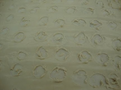
This mixture was a pleasure to spread. It is easy to create thick and thin areas and I could see that the fabric underneath was already absorbing the water from the resist so I knew it would dry quickly. After the paste was applied I used a chopstick as a drawing tool and drew into the paste. As predicted, it was drying fast and I worked quickly to make my marks. It is not an issue of not being able to continue to draw into the paste but it does start pulling up off the fabric as it dries more.


Marks in wet resist


Marks in wet resist


Marks in wet resist

I left this in an unheated studio with a fan positioned to aid the drying and by the next day it was dry to the touch. I did leave it until the afternoon before I applied dye. The surface is really beautiful. It is smooth and leathery where there were no marks and a great ivory color. There was only a small amount of crazing so I did scrunch the fabric up some to add cracks.

I mixed a medium shade of moss green and thickened it with print paste. This was brushed onto the surface. The application on this surface was much easier than onto my first flour resist piece.


Thickened dye applied to dried resist.


Thickened dye applied to dried resist.


Thickened dye applied to dried resist.


Again, this dried very quickly. It took only about 24 hours to dry. I did check the back to see how the dye had penetrated the surface and decided to pick off some of the flour resist and apply more dye. In the final piece you can see some larger areas of the green and these are the areas I opened for more dye absorption.

I only waited 4 hours before removing the resist and dye. I loved the surface on the piece and would have just left the paste on if possible. At this point I am not sure if I will add more color to the fabric, try to finish the piece as a whole cloth composition or cut it into pieces to be used in other compositions. I will definitely use this resist again and this study proved that experimentation is often required to get a mixture adjusted to a usable state.

Thank you for stopping by and I love to hear your comments. Please, if you try this resist , let me know how it works for you.

Sunday, March 28, 2010

Golden Acrylic Workshop at USCU


Patti demonstrates how to manipulate the surface of an acrylic skin.


Friday I had the opportunity to attend a workshop in Spartanburg SC at the University of South Carolina Upstate. The workshop was sponsored by the art department headed up by Jane Allen Nodine. You may remember Jane from an Artist Profile I did of her last year.

The workshop was presented by Patti Brady who is the Working Artist Program Director for Golden Acrylic and focuses on the new line of mediums which Golden rolled out about a year ago. This line of products feature mediums for digital transfers which can be prepared and sent through printers. They can then be manipulated and layered giving rich complex surfaces.


Sample Card of Mediums with various additives which alter color and texture.


The process revolves around making acrylic skins by applying a thin layer of the different mediums onto a hard surface and then allowing them to dry. The are many components which can be added to these mediums before the skin is made and after the skin is made. When it dries you tape it to a sheet of paper and you can actually run this through an ink jet printer thus transferring an image you had prepared to the skin.


Some of My Exercises

Of special interest to many of you is the fact that these products are compatible with textiles and she showed samples of various types of fabric she had printed on. The images were very sharp and the hand of the fabric was relatively soft. These products work on natural as well as synthetic fabrics.


Here Patti demonstrates how to create a skin using one of the new mediums.


I am familiar with Patti's work and could never fathom how they were made. I don't pretend to understand all that she does in her work but seeing her demonstrate the many techniques she showed I have a bit of insight to her multi-layered and complex images. You can see some of her drop dead gorgeous work at her website: http://www.pattibrady.com

Patti has also just recently published an excellent book titled: Rethinking Acrylic which you can order from her website or via Amazon. We purchased a copy and while it is jam packed with information, it is easy to understand and packed with photography demonstrating techniques.

As part of the workshop we received generous samples of some of many products as well as some of their paint products, an amazing hand painted color card of all their colors and several copies of JUST PAINT which is Golden Artist Colors newsletter. You can also sign up for this newsletter at : http://www.goldenpaints.com. I'm not sure if it is possible but I suggest you look them up online and request Issue 20 and you can read about these new products.

Thank you Jane and USC Upstate for sponsoring this workshop and thank you Patti for sharing such exciting information.


Proof of a busy day


Thank you for dropping by and your comments and questions are always welcome.

Friday, January 8, 2010

Developing Your Aesthetic


Looking Out the Back by Elizabeth Barton


Just recently I had an email exchange with my friend Elizabeth Barton relating to personal aesthetic. Elizabeth is an artist who has been working with fabric for sometime and maintains an excellent blog where she writes about her thoughts on art and art making.

Elizabeth visited me recently and we discussed our attractions to complexity and/or simplification when composing a work. My work is abstract and generally utilizes large shapes with the detail coming from the quilting. Elizabeth often works from photographs and recognizable imagery with varying amounts of detail. We talked about how much information was desirable and the fact that with recognizable imagery, the minds eye wants to read certain things into the composition.

This conversation led to the both of us agreeing that we each had a specific way of working and that we both were sometimes attracted to work which is unlike what we do. Elizabeth posed the question: Is it possible to be attracted a particular approach to making art yet be unable to work in that way. Example: You might love very spare work or very intense work etc. that other artists make but when you make art, you find you are not happy with those elements.

This is actually a concept of which I have been aware for sometime. There are artists whose work I adore and who perhaps work very differently from me. When I attempt to work in a manner similar to another person, my aesthetic is not satisfied. I don't totally understand this duality but I think we build our 'eye' through observation and study and by being open to many different kinds of art experience.

I did a tiny search for information on this duality of aesthetic and didn't find anything but I did find some good information about learning to build your personal aesthetic.

This first link is to an excellent article by Ronald H. Silverman, Ed.D., Professor Emeritus of Art, California State University, Los Angeles. Dr. Silverman discusses the components of looking at art and how this feeds into building and understand your aesthetic. It is well written and easy to read and follow.

The second link is from The Warhol. This link is to the Warhol Museum and their resource pages. If there are any of you who are teachers, they have some excellent lesson plans and powerpoint programs which are are available and I believe they are free.

I would love to hear any comments about building personal aesthetic as I know I have some readers who have very well developed aesthetics.