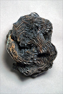
Divide ¦ 2012
Barbara Murak
Knitted construction
7″ x 8″ x 8″
United States
7″ x 8″ x 8″
United States
I have continued to think about the work presented in FiberArt International. The range of expressions was very impressive.
During the last few years my own personal work has moved from intense color to a very muted palette and I am thinking this may be a bit of a trend as that was the predominate palette in this show. Work in 3-D was also a large part of this show.
Barbara Murak's Knitted construction is a little jewel. On her website this piece is titled Divide. I could not look at the piece without thinking of a tidy brain in all it's ruffled-bilateral glory. It had a wonderful presence despite the small size and if it were living in my house I'm sure I'd give it a "people" name and speak to it as I passed by.
Untitled #3 ¦ 2010
Frank Connet
Copper with black patina
9″ x 7″ x 5″
United States
Copper with black patina
9″ x 7″ x 5″
United States
Frank Connet's Untitled #3 was another sculpture piece of a diminutive size with big appeal for me. I love this artist's work and have seen various works previously but this was the first piece I've seen in person. I can't really tell you what the material is used in this work. While it looks like fabric and you can see the "thread" which pulls it into it's form, I think it is copper mesh and wire. If you visit his website he refer's to similar work as being "electroformed" shibori. I appreciate the organic appearance of this work contrasting with man-made materials. I also was attracted by the very mysterious quality of the form and the construction. Beautiful, yes, but somehow menacing.
Etude 36: Arabesque: Contemplation ¦ 2011
Jane Dunnewold
Mixed media, silk ground, tuxedo shirt, India Ink, black sand; hand painting, screen printing
11″ x 43″
United States
Mixed media, silk ground, tuxedo shirt, India Ink, black sand; hand painting, screen printing
11″ x 43″
United States
Two works which were just the opposite of sculptural were the pieces by Jane Dunnewold and Joan Schultz. Each of these pieces had the neutral palette I spoke of but were very 2-D. I could see each of these works in drawing, printmaking, or painting shows and no one would question their inclusion. The use of textiles was there but not necessarily the most important element of the work. This could be said about any number of the pieces in the show.
Etude 36: Arabesque: Contemplation by Jane was exquisite in technique. Flat and perfect. Jane has a very unique process/technique for construction of her work which you can read about on her website. I was also attracted to the format of this work and of the work by Joan Schulze. Each work was very wide in proportion to the height which invites the viewer to "read" the work in a very specific way. Unfortunately, the proportion makes it difficult to show in a catalog. Both works are pictured on the same page and each image crosses the center crease of the page so they aren't shown to their best advantage.
The Drawing Room ¦ 2011
Joan Schulze
Silk, paper, glue transfer, direct printing, painting, oil pastel; pieced
12″ x 50″
Silk, paper, glue transfer, direct printing, painting, oil pastel; pieced
12″ x 50″
The Drawing Room by Joan Schulze is a multi-layered work incorporating all sorts of images, bits and pieces which she revealed were sometimes taken from her previous work. Like many artists, she has a reservoir of older work from which she can draw. How wonderful! The images appear and disappear and you are left to ponder the sources. The work has some simple, well placed stitching and while I know the work is very sturdy, it has a frail quality that old paper often has. Very inviting.
Ahhhhhh. Loved the show.
***
Thank you for spending time at
Studio 24-7!
I love hearing from you
so don't forget to
Comment.
It's FREE ya know.


